This is my second post for the week-end and, as some of you will know I am not a prolific blogger, this is a bit unusual for me.
I have had ideas floating through my head all week-end for this new card. When I finally decided on layout, theme, and colours, my original ideas were dramatically changed. That seems to be my usual way of creating! I might still make the original idea up, if I can figure out how to make it work.
This card is for three challenges:
Clean and Simple FTL#141 - Layout
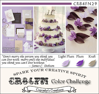
CR84FN29 - Colours: Light Plum, Plum, Kraft
Less is More - Theme: Butterfly/Butterflies (I had already made a butterfly card this week-end, but I thought my design was probably a bit "More" than "Less", so decided to try again)
Here is the CAS FTL141 Layout:
These are the gorgeous colours at CR84FN:
Here is my card:
I reversed the layout to suit the direction of the sentiment. It's been a while since I used my wheel to stamp, and probably a bit longer since I've done any heat embossing, so I am really enjoying that border along the bottom of the card. I also clear embossed the flowers on the butterfly to give it a little shine.
What I used (all Stampin' Up!):
Card: Pale Plum, Perfect Plum, and Sahara Sand (?) I ran out of Kraft!
Ink: Perfect Plum, Versamark watermark
Ribbon: Elegant Eggplant grosgrain
Stamps: Flight of the Butterfly, It's Beautiful (wheel)
It is certainly Clean and Simple, but is it too CAS? Is that possible? I feel like something's missing.
What do you think?
Michelle
xxx


